Stata Fundamentals 3: Linear Regression
More information on how the session is run
How to work together:- Plesase turn on your microphone and webcam.
- One shares the screen and the other requests remote control.
- Take turns on who types for each exercise.
- Ask the trainer if you struggle to find a solution.
- Use the help command. To get help with a specific command type help "command name"
- Search online. The statalist.org forum is usually the most useful resource.
- Use familiar Stata commands to explore a dataset prior to running a regression analysis.
- Create and customize scatter plots
- Run a simple linear regression and read the analysis output.
- Create scatter plots for a set of variables using a scatter matrix
- Run a multiple linear regression and read the analysis output.
- Create a correlation matrix.
Linear Regression
Stata allows you to easily perform and visualise simple linear regression.
For this example, we will use the sample dataset nlsw88.dta in-built in Stata. We can access this dataset with the sysuse command. Add the clear option, if a dataset is already loaded in Stata.
. sysuse nlsw88.dta, clear
(NLSW, 1988 extract)
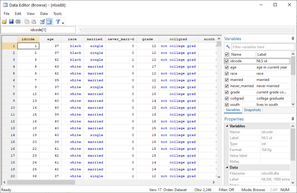
Let us start by inspecting the variables in the dataset. We use the describe command, to get an overview of all variables in the dataset and what they represent.
. describe

Contains data from C:\Program Files (x86)\Stata15\ado\base/n/nlsw88.dta
  obs:         2,246                          NLSW, 1988 extract
 vars:            17                          1 May 2016 22:52
 size:        60,642                          (_dta has notes)
--------------------------------------------------------------------------------
              storage   display    value
variable name   type    format     label      variable label
--------------------------------------------------------------------------------
idcode          int     %8.0g                 NLS id
age             byte    %8.0g                 age in current year
race            byte    %8.0g      racelbl    race
married         byte    %8.0g      marlbl     married
never_married   byte    %8.0g                 never married
grade           byte    %8.0g                 current grade completed
collgrad        byte    %16.0g     gradlbl    college graduate
south           byte    %8.0g                 lives in south
smsa            byte    %9.0g      smsalbl    lives in SMSA
c_city          byte    %8.0g                 lives in central city
industry        byte    %23.0g     indlbl     industry
occupation      byte    %22.0g     occlbl     occupation
union           byte    %8.0g      unionlbl   union worker
wage            float   %9.0g                 hourly wage
hours           byte    %8.0g                 usual hours worked
ttl_exp         float   %9.0g                 total work experience
tenure          float   %9.0g                 job tenure (years)
--------------------------------------------------------------------------------
Sorted by: idcode
Although it is possible to include categorical variables in a linear regression model, in this tutorial, we will only consider numerical non-categorical variables.
Examples of a categorical variable is sex, race or occupation. These have a limited set of values and there is no inherent order in the different values.
Examples of numerical non-categorical variables are age, wage, hours. These variables might have an unlimited set of values or they can be ordered in a pre-defined way.
To have a look at the whole dataset and to narrow down potential variables for our analysis, we use the browse command.
. browse
We are interested in the two variables wage and tenure. Performing simple summary statistics can help you to better understand the distribution of the variables.
. sum tenure wage

    Variable |        Obs        Mean    Std. Dev.       Min        Max
-------------+---------------------------------------------------------
      tenure |      2,231     5.97785    5.510331          0   25.91667
        wage |      2,246    7.766949    5.755523   1.004952   40.74659
Scatter Plots
Stata has a very easy-to-use graphical interface to create all plots. However, it is useful to get used to using code instead of the graphical interface as early as possible to be able to work your way up to more sophisticated graphs.
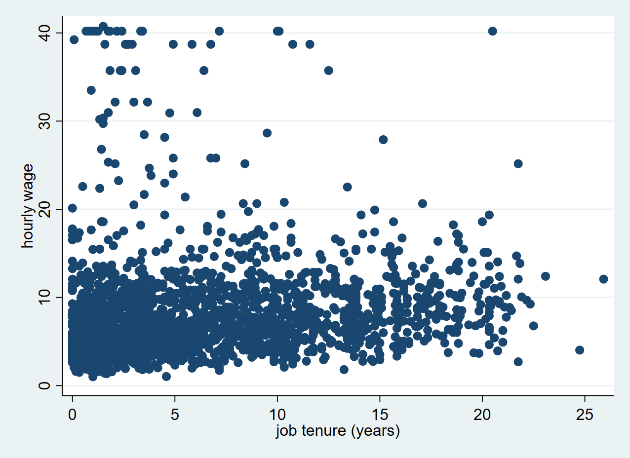
Here’s how you make a very simple scatter plot in Stata using the scatter command. Remember that the first variable is always displayed on the Y axis and the second variable is displayed on the X axis.
. scatter wage tenure
Exercise: Scatter plot
- Open the auto dataset, which is like the nlsw88.dta data one of Stata's built-in datasets.
- Explore your dataset using the different commands that you have learned so far. In your opinion, on which variables could you perform a linear regression?
- Make a scatter plot with the miles per gallon of the car (mpg) and their weight (weight). What is the relationship between weight and mpg?
- Customise your plot to show the markers in a different colour and symbol.
- Bonus: Can you show a label with the model of the car in your scatter plot?
Running a linear regression
Now that we have visualised the relationship between tenure and wage on a scatter plot, it is time to find out if there is an actual linear relationship between the two variables. We can find out by using the regress command, which will calculate a model to estimate the relationship between the wage and tenure variable.
Remember to type the dependent variable first and the independent variable second.
. regress wage tenure

      Source |       SS           df       MS      Number of obs   =     2,231
-------------+----------------------------------   F(1, 2229)      =     72.66
       Model |  2339.38077         1  2339.38077   Prob > F        =    0.0000
    Residual |  71762.4469     2,229  32.1949066   R-squared       =    0.0316
-------------+----------------------------------   Adj R-squared   =    0.0311
       Total |  74101.8276     2,230  33.2295191   Root MSE        =    5.6741

------------------------------------------------------------------------------
        wage |      Coef.   Std. Err.      t    P>|t|     [95% Conf. Interval]
-------------+----------------------------------------------------------------
      tenure |   .1858747   .0218054     8.52   0.000     .1431138    .2286357
       _cons |   6.681316   .1772615    37.69   0.000     6.333702    7.028931
------------------------------------------------------------------------------
As a result, Stata gives me a range of useful statistics. Perhaps the most interesting is the first line lower table (tenure), in which we see that there is a regression coefficient of 0.1858747, alongside a standard error of 0.0218054.
We can interpret this as each year increase in work tenure is associated with an increase of 0.1858747 in hourly wage. The standard error gives us an indication of how certain this estimation is. The lower the standard error, the more certain we can be that the regression coefficient is a good estimation of the relationship between the two variables.
The p-value (P>|t|) shows that the correlation is statistically significant, as it is below the critical level of 0.05. The _cons line shows us values about the intercept. These are usually not very interesting for the interpretation of the data. The intercept is the predicted value for a tenure of 0 years, which is 6.681316.
Scatter plot with fitted line
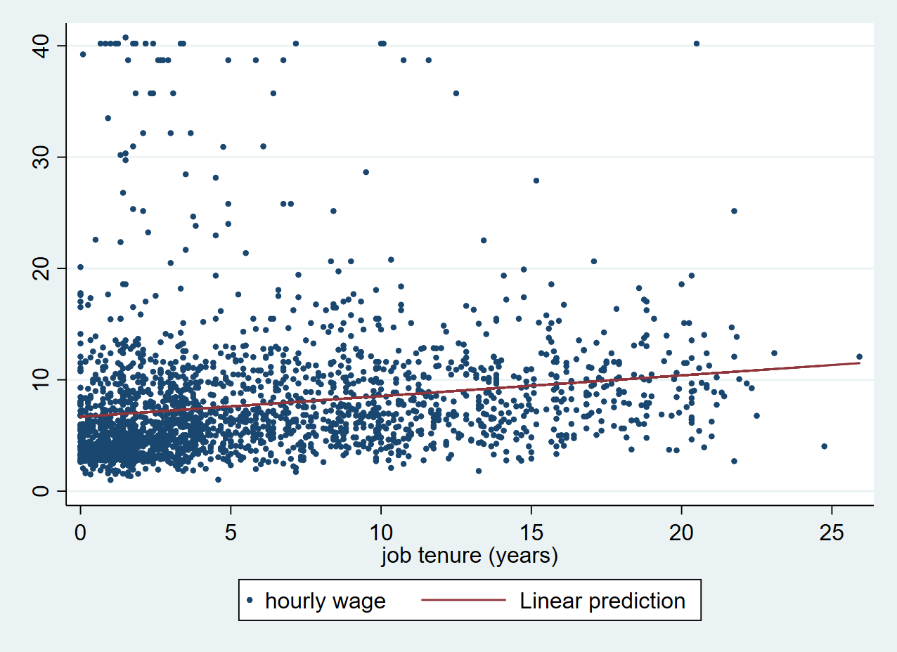
Based on the model that Stata has calculated, we can now create a new variable with predicted values for wage. We can use the predict command to generate this new variable with predicted values. We create a new variable called pred_wage by typing:
. predict pred_wage, xb
(15 missing values generated)
Using the fitted values from pred_wage, we can now add a fitted line to our scatter plot.
With the twoway command, we can combine a scatter and a line plot in a single chart. We first plot the scatter and then the line on top. When using twoway the scatter and line command both have to be put in separate parentheses.
. twoway (scatter wage tenure, msize(0.5)) (line pred_wage tenure)
Exercise: Simple linear regression
- Perform a regression analysis with the variables mpg and weight
- Fit a regression line on your scatter plot.
Multiple Linear Regression
In the next section, we look at an example of multiple linear regression. Here we have multiple predictors, or independent variables. For this, we will be using a life expectancy dataset from the Stata website:
. use http://www.stata-press.com/data/r13/lifeexp, clear
(Life expectancy, 1998)
Scatter Matrix
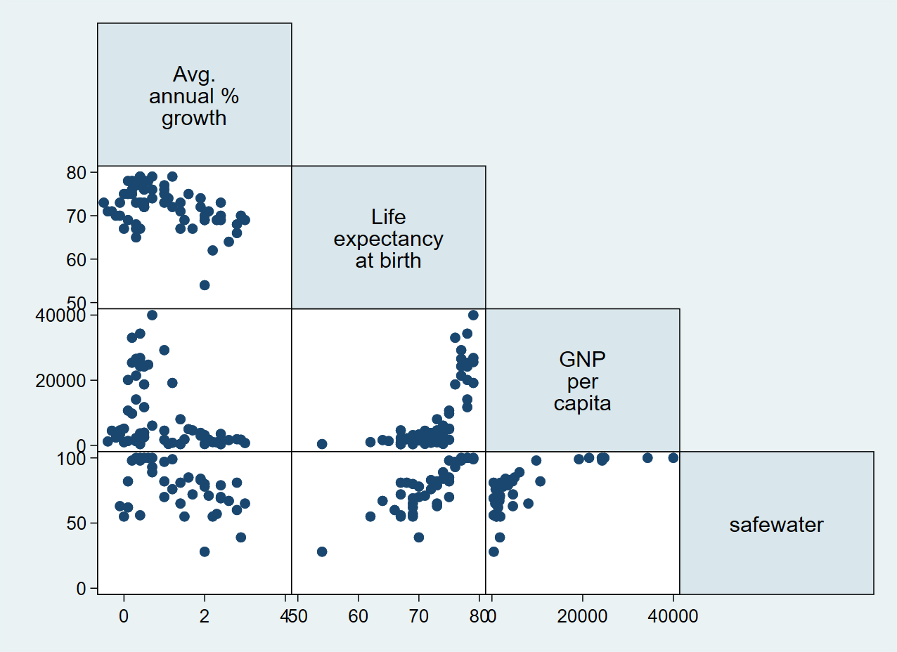
First, we can do a preliminary screening of the relationships by creating a scatter matrix using the graph matrix command passing all variables that we would like to explore.
. graph matrix popgrowth lexp gnppc safewater
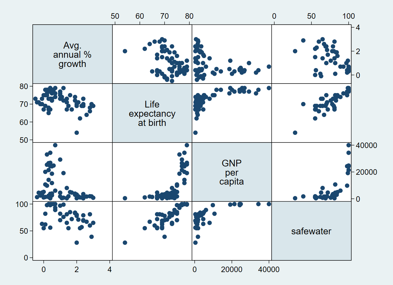
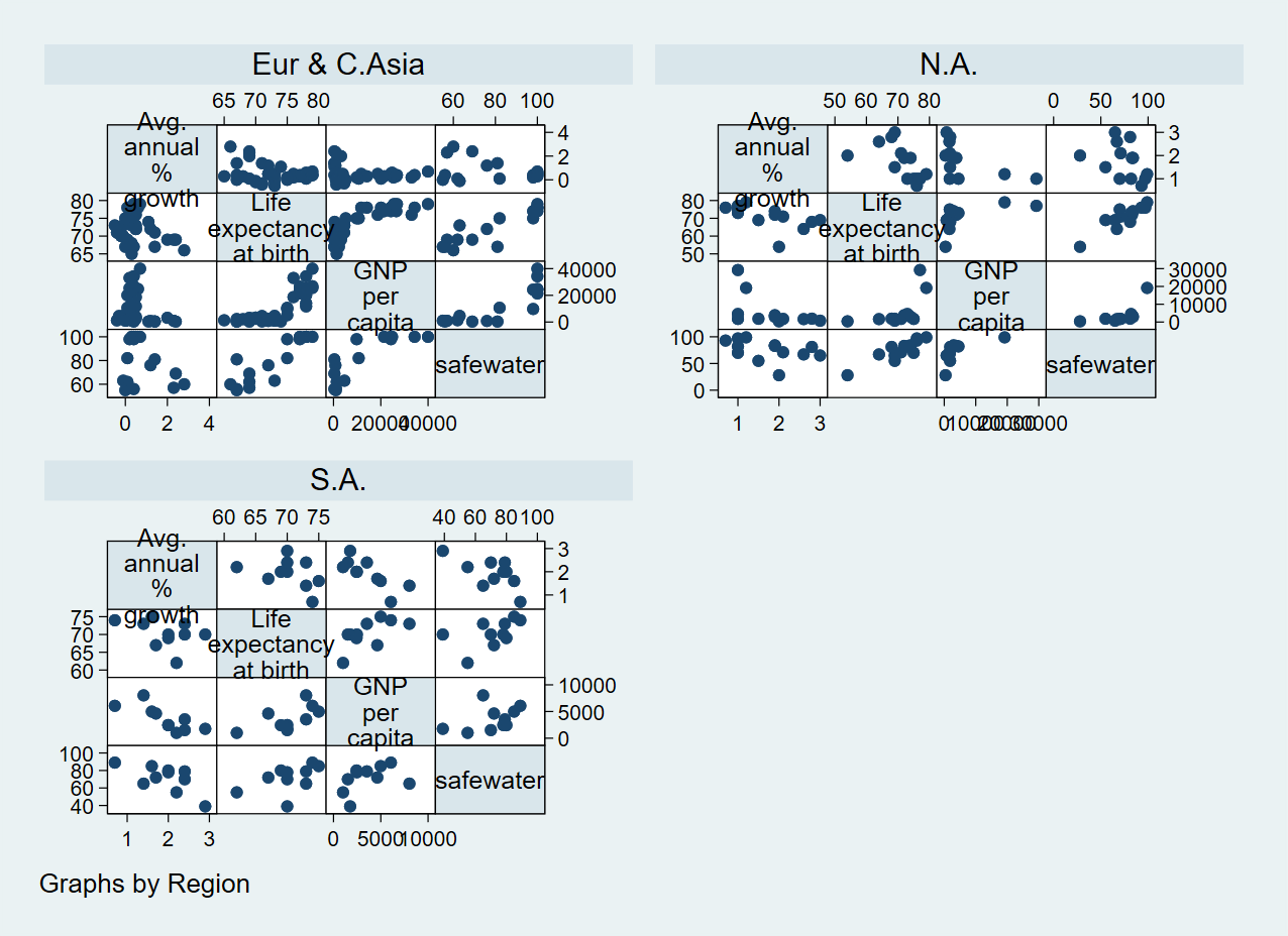
We can also group our scatter matrix by another variable using the by() option:
. graph matrix popgrowth lexp gnppc safewater, by(region)
Or we can only show half of the graph:
. graph matrix popgrowth lexp gnppc safewater, half
Running a multiple Linear Regression
Similar to the previous example, we can use the regress command for multiple variables, with the dependent variable going first.
. regress popgrowth lexp gnppc safewater

      Source |       SS           df       MS      Number of obs   =        37
-------------+----------------------------------   F(3, 33)        =      4.28
       Model |  8.66091026         3  2.88697009   Prob > F        =    0.0117
    Residual |  22.2693603        33  .674829098   R-squared       =    0.2800
-------------+----------------------------------   Adj R-squared   =    0.2146
       Total |  30.9302705        36  .859174181   Root MSE        =    .82148

------------------------------------------------------------------------------
   popgrowth |      Coef.   Std. Err.      t    P>|t|     [95% Conf. Interval]
-------------+----------------------------------------------------------------
        lexp |  -.0611253   .0480779    -1.27   0.212    -.1589404    .0366899
       gnppc |   -.000031   .0000196    -1.58   0.124     -.000071    8.96e-06
   safewater |   .0066364    .014125     0.47   0.642    -.0221012     .035374
       _cons |   5.477221   2.803195     1.95   0.059     -.225923    11.18036
------------------------------------------------------------------------------
The resulting table looks very similar to the results of the simple linear regression and you can check the relevant statistics for each variable.
This analysis yields and interesting pattern. The upper right table gives us statistics on the model as such. The R-squared value indicates how well the model predicts the The p-value (Prob > F) is below the critical value of 0.05, which means that there is sufficient evidence for us to conclude that the predictors (lexp, gnppc, safewater) together predict the independent variable popgrowth.
At the same time, we can see in the lower table that none of the regression coefficients is statistically significant. This indicates that there is high correlation between our predictors.
Correlation matrix
We can use the pwcorr command to get a correlation matrix for all variables in our analysis.
. pwcorr popgrowth lexp gnppc safewater

             | popgro~h     lexp    gnppc safewa~r
-------------+------------------------------------
   popgrowth |   1.0000
        lexp |  -0.4360   1.0000
       gnppc |  -0.3580   0.7182   1.0000
   safewater |  -0.4280   0.8297   0.7063   1.0000
Exercise: Multiple linear regression
Now, try to perform a multiple linear regression by yourself. We use the auto dataset again:
. sysuse auto.dta, clear
(1978 Automobile Data)
- Make a scatter matrix of the variables mpg, price, weight and length. What do you think is the most likely relationship between the variables?
- Can you show two different plots for foreign and domestic cars?
- Perform a regression analysis with the previously mentioned variables. What do the results mean?
Final task: Please give us your feedback!
Upon completing the survey, you will receive the link to the solution file, to check how your commands compares to the sample solution.
In order to adapt our training to your needs and provide the most valuable learning experience for you, we depend on your feedack.
We would be grateful if you could take 1 min before the end of the workshop to get your feedback!
Click here to open the survey!